SWIMWEAR BRAND STrategy & REDESIGN
BRIEF
Our team was tasked with redesigning the ecommerce site for a sustainable swimwear brand. The California-based brand has been around for 20 years and has maintained loyal shoppers who have grown up wearing the suits. They take pride in not only offering timeless and flattering styles that fit different body types, but also innovating products with plant-based materials that are sustainable and eco-friendly.
Along with aesthetic updates, our goals were to improve way-finding, create a Fit Guide, and interweave the brand story and sustainable mission throughout the site experience.
Role: UX Design and Strategy
Tools: Sketch, Zeplin, Google Slides
Platform: Shopify
Workflow: Agile (1-2 Week Sprints)
Image courtesy Yoann Boyer for Unsplash
Research
My process typically begins with a thorough review of the existing site to understand what is effective and where there is opportunity for improvement. This also helps me to learn more about the brand, its voice, and any other themes to align on priorities and identify any outlier questions that were not covered in the initial kick-off.
This stage may include:
UX Audit: Evaluate key pages and templates through the lens of hallmark UX design heuristics to identify problem areas, ADA compliance, page load issues, and other top-priority items.
Content Audit: Review the content on the site, paying close attention to what is being communicated and how. What is the overarching brand message, and how is it conveyed?
Analytics Review: May include Google Analytics and/or platform analytics. Key metrics are reviewed to understand how the current site has performed and what areas are getting the most traction.
Information Architecture Review: Assess the way-finding tools (search, filters, navigation), product categories, and taxonomy to identify how the site is currently organized.
After developing a deeper understanding of the current site experience, I review competitors and analogous experiences across the web to help identify how the user experience should align with current best practices in the space. For this project, I reviewed 25+ high-end or direct to consumer swim and intimate brands (Bikyni, Lively), as well as brands with sustainable practices and messaging (Everlane, Reformation).
Due to the short timeline on this project, I did not have the ability to conduct direct user research through surveys or interviews. Instead, user archetypes were developed based on insights gleaned from the above brand and industry research and publications (Baymard, Gartner) related to general shopping behaviors and attitudes about body image. Through this, I was able to distill the brand’s audience into four types of users:
APPROACH
Upon completion of research, I identify the “situation and complication” for the industry, consumer, and brand. This ensures that the problem statement is holistic and deeper than just “increase conversion” - it is addressing issues that both the business and user.
Industry: From the California cut to plant-based fabrics, the brand is the one that “started it all.” And while imitation may be the highest form of flattery, the influx of DTC, sustainable swim options has made it increasingly difficult to convey that the brand paved the way.
Consumer: For many consumers, shopping for bathing suits is a complicated, even emotional process. The online aspect can further complicate matters; taking the risk on an expensive suit that may not fit can ultimately deter users from purchasing.
Brand: There are clear advantages of purchasing suits as separates (ability to mix and match, buy what you need, select different sizes). However, the current site experience can make it challenging for users to find and pair sets, resulting in lower AOV and drop-off.
How can we bring awareness to the brand’s influence, address fit concerns, and make it easy for users to find and purchase full sets?
By integrating the brand STORY and sustainable mission with shoppable moments, guiding users to find the right fit, and empowering users to discover and pair sets.
Content Strategy
The content strategy injects the research and product strategy into the bones of the site. Beginning with taxonomy, I identify all attributes associated with the products to inform the options for filtering and sorting, as well as the navigation.
Filtering should be robust and enable users to filter results based on both style preferences and fit requirements. Additionally, letting users sort and organize products in ways that make sense and is useful to them provides them with a sense of control.
Navigation should be intuitive and engaging, encouraging a streamlined pathway for mission-oriented shoppers (New Arrivals, Shop) and product discovery for casual and new shoppers (Our Story). The Fit Guide would also be prominently placed in the global navigation, as we know that trusting fit and knowing what size to purchase is a crucial factor for conversion.
The sitemap provides our team with an overview of every page that would live on the site, what content needs to be created, and any additional assets that need to be requested. This also provides developers with a guide of how many different page templates would be included and which pages would be most complex to build, and therefore tackled first.
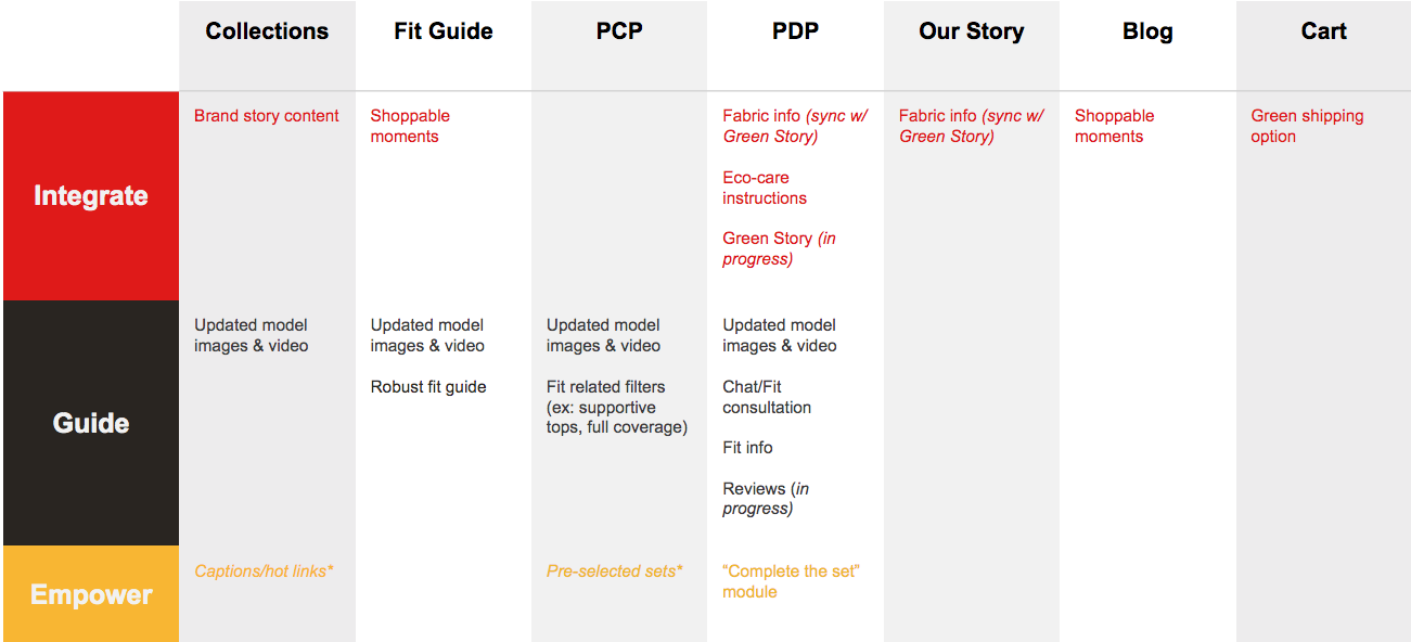
Lastly, the feature breakdown is provides a summary of all the aligned upon features and where they would live on the site. This is then used to inform narrative roadmaps and/or wireframes to ensure that we are accounting for all new elements.
Design
Wireframes were not reviewed with the client and were therefore low-fidelity and provided to the design team as a high-level guide with directive text included.
As a small team working in 1-2 week sprints, we maintained consistent communication and collaboration to push this project through the finish line.
The anticipated launch date is set for July.


